How do you select prints and patterns that work well with your personal value contrast?
Value is the technical colour word that means how light or dark a colour or neutral is.
Contrast is how different the colours are in comparison to each other.
So often when I’m doing a personal colour analysis my client will tell me “I can’t wear that colour” and it may be a colour that really suits them, so why do they think they can’t wear it?
It’s because they are not wearing it in combination with another colour, and their value contrast demands a combination of different values, rather than just wearing one depth of colour in an outfit. As soon as I explain their value contrast to them, and how to wear that colour in combination with another they see how it wasn’t that colour that was wrong, just how they were trying to wear it.
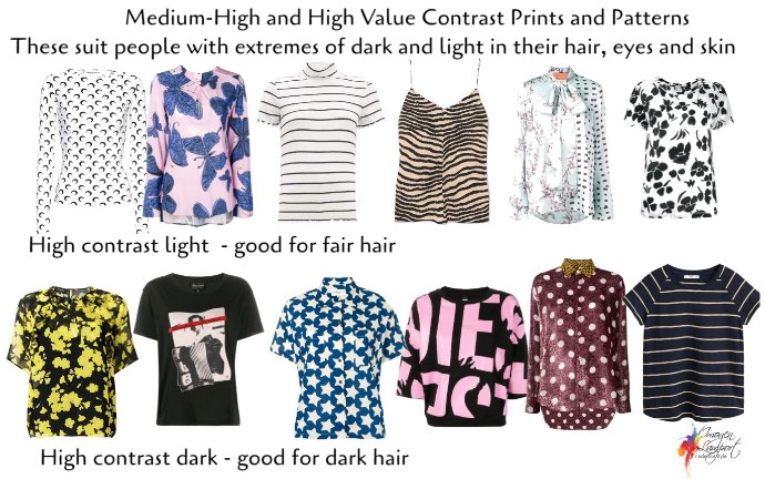
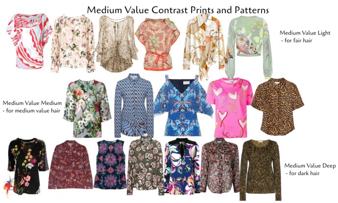
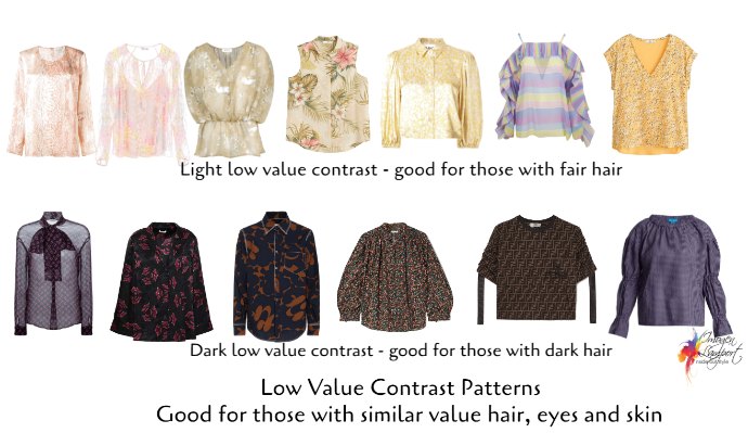
1. Matching the Value Contrast of the Print to Your Value Contrast
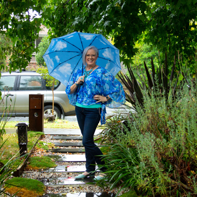
When you’re looking for prints and patterns they want to relate to your value contrast. This is, relating in lightness and darkness to your hair, eyes and skin. When you repeat the combinations of your own colouring in a pattern, you create beautiful harmony and a stylish look that makes you the star (rather than the print or pattern taking the attention away).
- If you have a high value contrast, choose prints that have a combination of light and dark elements.
- If you have a medium value contrast, choose prints that have, light with medium value elements or medium with dark value elements or light with medium and dark elements.
- If you have a low value contrast, choose prints where the value of the colours is similar.
2. What Colour Background Should Your Prints and Patterns Be?
Ideally, choose a print with a background colour that relates to the depth of your hair colour.
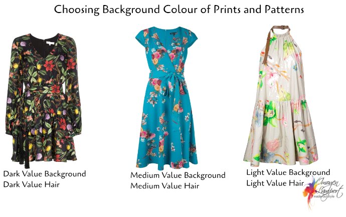
- So if you’re fair, choose a print with a light background
- If you have medium value hair, then choose a pattern with a medium value background.
- If you have dark hair, choose a print with a dark background.
As someone who has light value hair and medium value contrast, my best prints and patterns have these properties in common with me.
 3. How to Wear a Value Contrast Print that Is Not Your Best
The easiest way to wear a print that is outside of your value contrast is to find one that steps through all the values (particularly if you are going higher value contrast than your optimal value contrast). 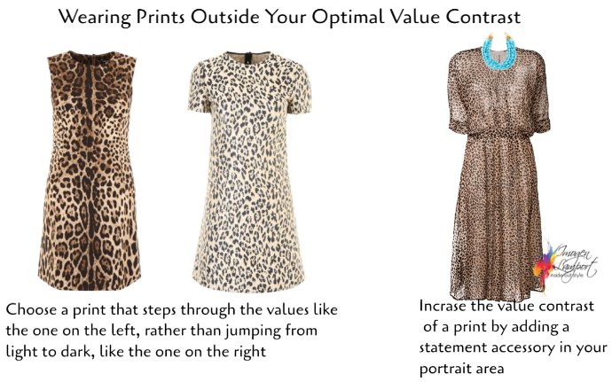
If you are a high value contrast and want to wear a medium or low value contrast print – use an accessory – scarf or statement necklace to increase the value contrast of your outfit.
Start Your Training and Follow Your Passion
Get your first two lessons free – click here! Choose your own learning style as we offer personal stylist and personal colour anlaysis courses both in the classroom or online training. All image consultant training courses also include a 12 month mentoring program once your training has finished so that you succeed in setting up your own image business. We also offer ongoing educational webinars for all personal stylists on image and marketing related topics which you can access at any time from the comfort of your own computer.
Want more information about course content and pricing? Download our AoPI Course Outline Now!
Please do let me know if you have questions about the training. I’m excited about this rare opportunity and I don’t want you to miss out!


