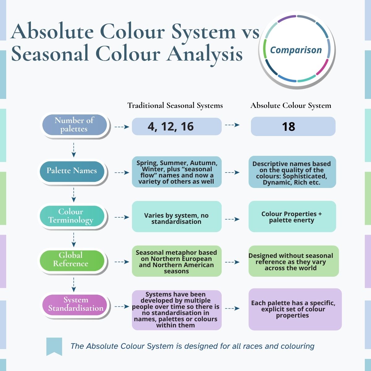
The Absolute Colour System is an 18-palette personal colour analysis system created by Australian award-winning, internationally certified colour and image expert Imogen Lamport in 2009 after working with clients who just didn’t fit existing colour systems.
Rather than categorising people into the traditional four, twelve or even 16 seasons, the Absolute Colour System analyses the scientific colour properties that influence how colours harmonise with an individual’s natural colouring, including undertone, value and intensity.
With nine warm and nine cool colour directions, the system was developed to provide greater nuance for the enormous diversity of human colouring across different skin tones, ethnicities, ages and stages of life. Along with in-person analysis, Imogen developed a virtual analysis system in 2014.
It answers a question that drove me to create the system in the first place:
What happens when someone simply doesn’t fit neatly into an existing colour palette?
Why I Created the Absolute Colour System
Seasonal colour analysis was an important development in personal colour analysis, but in my work with real clients I repeatedly encountered people whose colouring didn’t fit comfortably within the available palettes. I’d have to give them the “least worst” palette, rather than one that was the best for them.
I became frustrated that the existing systems didn’t seem to account adequately for the diversity of colouring I encountered in my clients. I also found the traditional seasonal references culturally and geographically limiting. In much of the world, including the majority of Australia, our experience of the seasons bears little resemblance to the colour associations of the traditional Spring, Summer, Autumn and Winter palettes
I wanted to bring personal colour analysis into the current century in a way that works for people at every age and stage of life. I wanted to create a more systematic approach, grounded in established scientific colour properties, that could accommodate the complexity I was seeing in real people.
How Does the Absolute Colour System Work? It’s Based on The Science of Colour
The Absolute Colour System draws on established principles of colour science, including the three dimensions described in the Munsell colour system:
Hue: the colour family, such as red, yellow, green or blue.
Value: how light or dark a colour is.
Chroma: how saturated, vivid or muted a colour appears. In the Absolute Colour System, I generally describe this as intensity, as this is easier for clients to understand.
For personal colour analysis, we also assess undertone, looking at whether colours with warmer or cooler characteristics create greater harmony with an individual’s natural colouring.
Rather than simply asking, “Are you warm or cool?”, the Absolute Colour System considers the interaction between undertone, value and intensity.
It is the combination of these colour properties that allows us to identify a more nuanced colour direction for each individual.
When applying this to people, we look at your colour properties and then match those properties with the colours most similar to what is innate in you. Just like listening to beautiful music, seeing people in colours that are in harmony with them is a visual delight..
Personal colour analysis isn’t simply about asking, “Are you warm or cool?” It is about identifying the combination of colour properties that creates harmony with the individual and each of the colour properties.
Click here to see a 3-dimensional model of the colour system.

Why Does the Absolute Colour System Have 18 Palettes?
The Absolute Colour System has 18 palettes (9 warm and 9 cool), each with a unique name that expresses the feeling of the colours contained within.
12 seasons still leave out some of the important nuance that exists in human colouring. 18 palettes are generic enough that you can find clothing in your colouring, but specific enough to select a set of signature colours within that palette that are perfect for each person.
More palettes mean a more nuanced approach and make it easier for consultants to find exactly the right palette for each client.
Each palette has an opposite undertone equivalent: same value, same intensity, just the opposite undertone. The system is scientific and logical, which makes use easy and fast. In fact, the act of colour draping is quick (only a few minutes), and the way the system and tools have been designed makes it easy to do groups of people at the same time.
Getting to Know the Palette Names
Back in 2004 when I started doing colour analysis, the seasonal system had fallen out of favour and tonal names (warm/cool, bright/muted, light/dark) were the ones that had begun being used. But these names were boring, and people found some of them off-putting (who wants to be muted, or dull, or dusky?).
So during the development of the Absolute Colour system I decided that I’d stay away from seasonal names, as much of the world’s seasons are “wet and dry”, and the existing seasons didn’t make sense to me as an Australian, where winter was dull and muted, and summer was warm and bright.
After listening to a colour expert talk about how the Japanese describe cool, dark and smoky colours as “Sophisticated” the idea for the naming of my colour system was born.
I started thinking about the quality and energy of each of the palettes and looked for names that related to those kinds of colours. So Zesty is bright and warm and contains lemons, limes and oranges, and Dynamic is bright and cool with a lot of energy. Rich is darker, warm jewel tones. Whilst Intriguing is just a little warm (not really warm), but it’s smoky and subtle and hard to describe.
I discovered that my clients loved these names so much more than tonal or seasonal names.
Who Does the Absolute Colour System Work For?
The system was designed to accommodate the diversity of human colouring rather than assuming everyone will fit neatly within a small number of predetermined categories.
All different ethnic backgrounds and skin colours – we have a range of bright to smoky palettes in both light and dark values, which means that the diversity of human colouring is covered.
All different ages – because colouring changes with age, our skin softens, our hair lightens, colour palettes change. Because the system is nuanced, you can move from one palette to the next seamlessly.
All hair colours – no matter if it’s natural hair or dyed, we have palettes that work from white hair through to black hair and everything in between.
How An Absolute Colour Analysis Works
Rather than comparing a client against all 18 palettes, the analysis works systematically, eliminating irrelevant directions as each colour property is assessed.
We drape our client firstly for their undertone to find out if they are warm or cool (we have multiple ways of testing this to ensure that we get it correct).
We then assess overall value, particularly the depth of the hair, because the relationship between your colouring and the depth of the colours you wear is an important part of creating visual harmony.
That gives us 5 drapes to compare (there is no point in draping all 18 palettes; that would be like trying to smell 18 perfumes to decide which is best). These 5 palettes we drape in a specific order, so we’re only changing one colour property at a time, making it easy to see what is working and what isn’t. We will find that we get down to two palettes quite quickly and easily, and from there we compare the whole palette (not just the few colours in the drape) so we get a fuller picture of the client in the context of those colours.
It’s a fast and simple process, which means that it’s very easy to do colour activations and groups as the draping isn’t a laborious process.
Want to Discover Your Absolute Colour Palette?
Check out our directory of qualified personal analysis colour consultants from around the world in our directory here. They can do both online and in-person analysis so you don’t have to travel if there isn’t anyone close by.
Want to Learn the Absolute Colour System?
Keep reading to find out more.
Explore our Personal Colour Analysis Training courses online or in-person
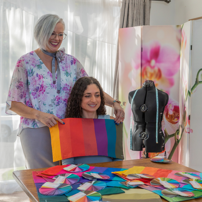
Colour Analysis Draping: In-Person and Virtual
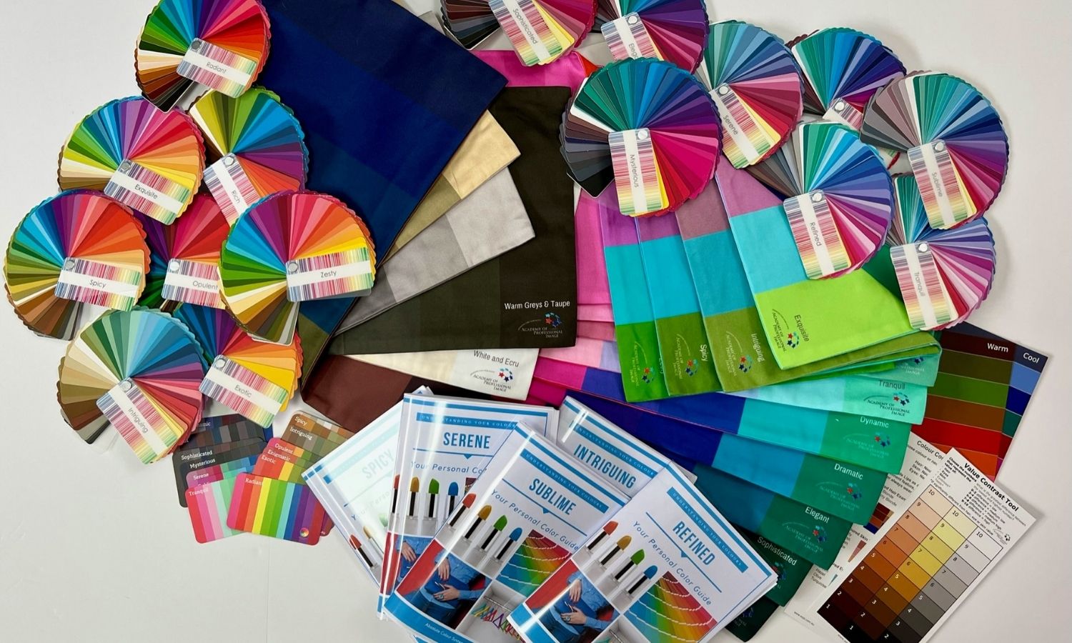
The Absolute Colour System comes with both physical drapes as well as virtual for doing online consultations.
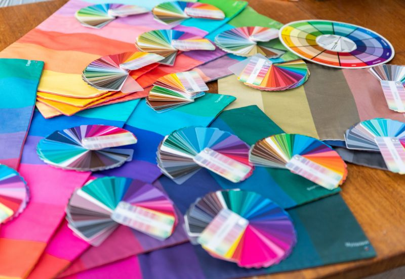
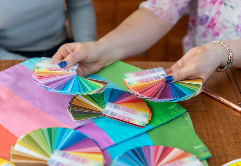
Our physical drape sets are simple to use and are perfect for both individual clients as well as demonstrations, group consultations, and colour activations. You don’t need hundreds of single colour drapes; we’ve simplified it so you can quickly find the ideal palette for your client with compact, easy-to-use drapes. No messing around testing lots of single colours and confusing your clients, as they don’t know what they’re really looking at.
We have created a simple system to drape your clients, which means it doesn’t take lots of time, so you can easily use it in group situations.
Plus, you get a range of neutral drapes so you can show your clients their best neutrals to base their wardrobe around, and which neutrals to avoid completely!
Our Virtual Drapes are also easy to use, and give you the option of doing colour analysis sessions with people from anywhere in the world.
We have been refining our Virtual Colour Analysis process since 2014, so much testing has gone on, with thousands of analyses having been done with the system. You will learn how to do this in our Module 2 Colour Practical (or in-person colour analysis training course), plus we have additional video pieces of training and support available for you to watch on demand.
Colour Palettes
Each Absolute Colour System palette contains 50 carefully selected colours, including both signature colours and useful wardrobe neutrals for that colour direction.
The physical palette fans out so you can place it directly against clothing, accessories, fabrics and patterns when shopping or creating outfits. The aim isn’t to find an exact match to one individual swatch. Instead, look at the palette as a whole and ask whether the colour you’re considering appears to belong with it.
We also offer compact card-sized palettes and virtual palettes that can be stored on a phone.
A virtual palette is a useful backup, but I recommend using your physical palette whenever possible. Screens are backlit and vary considerably in how they reproduce colour, whereas your physical palette and the garment you’re comparing it with are being viewed under the same light.
You order colours palettes through our website, and distribution is done by the closest Absolute Colour System distributor to you – we currently have distributors in UK, Czech Republic, USA and Australia.
Train in the Absolute Colour System
If you are excited to share your passion for colour with others, you might be an ideal person to train in the Absolute Colour System and become a colour consultant or image consultant.
We offer regular in-person training courses in our Melbourne Studio, along with on-demand, go at your own pace online training programs.
Maybe you have trained with another company in seasonal or tonal colour analysis and, like me, feel it’s limited. We also do conversion training so that you can start using the Absolute Colour System. Please don’t hesitate to reach out and chat with us if this is something you’re interested in.
Explore our Personal Colour Analysis Training courses online or in-person
Frequently Asked Questions About the Absolute Colour System
Click on each question below to find the answer
The Absolute Colour System is an 18-directional personal colour analysis system based on the science of colour properties – Undertone, Intensity and Value.
Warm Palettes
Light Value Palettes
Exquisite – Light, warm, soft tint (pastel)
Zesty – Medium light, very warm, brighter
Spicy – Medium light, warm, soft (toasted)
Intriguing – Medium light, just warm, smoky (toned)
Medium Value
Radiant – Medium value, warm, bright
Dark Value Palettes
Rich – Medium dark, very warm, bright
Exotic – Medium dark, warm, soft (toasted)
Enigmatic – Medium dark, just warm, smoky (toned)
Opulent – Dark, warm, medium bright
Cool Palettes
Light Value Palettes
Tranquil – Light, cool, soft tint (pastel)
Refined – Medium light, very cool, brighter
Sublime- Medium light, cool, soft (lightly toned)
Serene – Medium light, just cool, smoky (toned)
Medium Value
Dynamic- Medium value, cool, bright
Dark Value Palettes
Dramatic – Medium dark, very cool, bright
Elegant – Medium dark, cool, soft (lightly toned)
Sophisticated – Medium dark, just cool, smoky (toned)
Mysterious – Dark, cool, medium bright
Imogen Lamport is an internationally recognised, award-winning image consultant, colour expert and educator. She created the Absolute Colour System in 2009 after years of working with clients whose colouring could not be satisfactorily accommodated by existing colour analysis systems.
Seasonal analysis systems aren’t standardised; they grew from concepts rooted in art and have been modified by many people over the past 60 years. Multiple versions exist, with different names for the seasons, and the colours within each season vary depending on which seasonal system you are looking at.
The Absolute Colour System was created by Imogen Lamport in 2009. Based on the science of colour properties. It takes each of the three colour properties, looks at each of them as a continuum (not just an extreme) and has options for each value and intensity in both warm and cool undertones. There are 18 distinct palettes which means that there is enough nuance to suit all different complexions and colouring.
Through my work with clients, I found that 12 categories could still leave gaps when accounting for the combinations of value, intensity and undertone I was seeing
18 palettes provide enough nuance to identify an individual’s broader colour direction while remaining practical for finding clothing in the real world. Within that palette, we can then identify approximately 15 signature colours that are particularly harmonious for the individual.
Even within each palette, we find a range of around 15 signature colours for our clients so that they have a completely individualised palette, within the overall colour direction.
Yes. The Absolute Colour System is a tonal-based system, which is based on the properties of colour that are at the heart of all colours:
Value – which is the technical word for how light or dark a colour is.
Intensity – from bright and clear colours all the way down to very smoky, muted colours.
Undertone – the warmth (yellow based) or coolness (blue-based) the colours are created from.
Yes, the Absolute Colour System works well for all skin tones, and has been tested and is used in multiple countries around the world (from Thailand to India, to South Africa, Canada, America, Mexico, UK, and a variety of European countries).
Australia is a great place to create a colour system and the light is clear and clean, and our multicultural population means that we have access to a huge variety of different skin tones and colouring.
Your ideal palette may change as you age because your overall colouring can change. Hair commonly becomes lighter and less pigmented, while changes in skin and hair can alter your overall value, intensity and contrast
The most obvious change is hair colour – going grey means that hair lightens and gets softer. Even if you dye your hair, you will find that if you had very dark hair when young, your skin also changes and those very dark shades look harsh, and so most will start dyeing their hair lighter, and this changes your palette.
For some people, this means colours that once worked beautifully may begin to feel stronger or harsher than they once did
This is why our palettes are nuanced, and each is a step away, meaning there is always a palette you can move to.
A colour palette is a brilliant tool to help you find colours that work together.
The physical palette is the ideal tool, as it’s lit in the same way, in the same lighting, as what it’s being compared to.
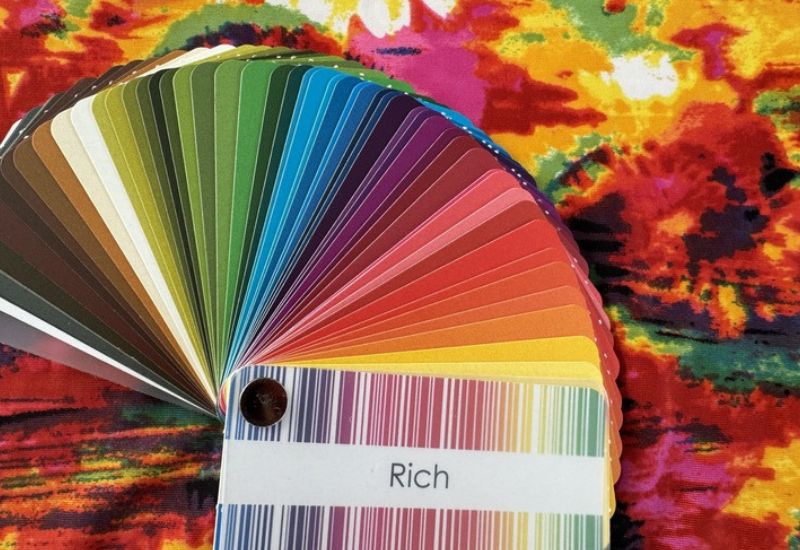
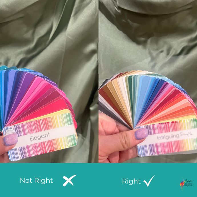
It’s not about matching the individual palette exactly, it’s about placing a fanned out palette on the colour (or pattern) that you’re considering and seeing if it blends with it.
Virtual palettes (a handy backup, but not ideal) are backlit, which means the colours can appear brighter than the item you’re comparing them to, giving you a false result.
Virtual Colour Analysis Since 2014
I have refined the process since then as technology has improved, so it’s accurate.
Online analysis works, but it can’t be done with one or two photos. I’ve developed a multi-step process to ensure accuracy. Not only does it involve draping your photo in our virtual drapes, but it also involves mailing you a set of mini-card palettes to photograph so that we get to see you in the context of those palettes.
Imogen Lamport, AICI CIP, is an award-winning image consultant, colour expert and educator known for her science and psychology-based approach to personal style. She created the Absolute Colour System in 2009 after years of working with clients whose colouring didn’t fit comfortably within the colour analysis systems available to her.