What is the easiest and best way to choose prints and patterns?
Match them to your colour palette! If you’ve had a personal colour analysis you should have a colour palette, a fabulous tool that will assist you in finding the colours in both solid
fabrics as well as patterned ones.
When you think about a colour palette, it shouldn’t be limiting you to selecting just the exact colours within the palette, instead, it’s like an executive summary of the thousands of colours you can possibly wear, but just can’t fit into your handbag!
This is why I always fan out a palette when selecting colours so that you’re not looking to match exactly, instead, you’re looking for the swatch to blend with the colours in the pattern or garment. Watch how I do this in the video.
Finding colours that flatter you will make you (your face) the focus, rather than the clothes (your body), and these colours will make you look more vibrant and alive, more rested and healthy, more youthful and energetic.
What’s not to love about that?
If you haven’t had a personal colour analysis in recent years (and yes, your colouring does change with age) then you can get one as part of my 7 Steps to Style program – find out about it here). It really will help you build a wardrobe of clothes that all go together, mix and match easily and make you look amazing!
Choosing Prints and Patterns to Go with Your Colour Palette
When choosing prints and patterns to go with your colours swatch you need to match the colour properties of the colours. This includes the intensity, undertone and value of the swatch with the print or pattern.
Intensity – how bright or smoky the colour is – you want to choose colours in a similar intensity to your palette – this way it’s easy to mix colours in your wardrobe.
Undertone – how warm or cool the colour is.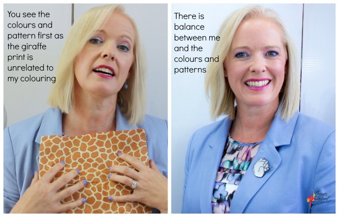
Value – how light or dark the colour is – if you have dark hair, your swatch will be overall darker, and if you have light hair, your palette will be overall lighter.
What if There is a Colour in the Pattern that Isn’t In the Pattern?
Quite frequently, colours are added to a print to make the print ‘pop’, these are colours that clash in some way or other.
If the incorrect colour is less than 20% (ideally less than 5-10%) then don’t worry about it. But if the incorrect colour is dominant in the pattern, then bypass that pattern for one that harmonises better with your palette.
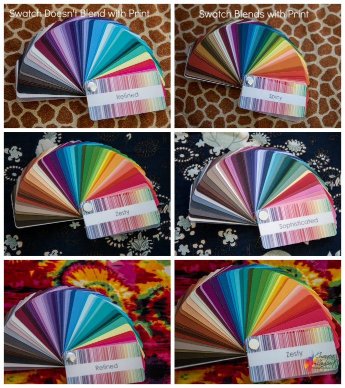
On the left, the swatches don’t blend with the prints. On the right, the swatches blend with the prints and would be a good choice for each of those colour palettes. Top – Undertone is incorrect on the left and correct on the right. Middle – Undertone of Zesty is too warm and the Intensity is too bright for the pattern, the value of Zesty is also too light for this print. Sophisticated has the right blend of coolness, depth and a smoky intensity. Bottom: Even though the Intensity of Refined works with the print, and the pink of Refined works with the pink in the pattern, the undertone is incorrect and the whole swatch doesn’t blend. On the right, the Zesty blends with the majority of the colours in the print and also has the same overall undertone and intensity so is a good match for this print.
Start Your Training and Follow Your Passion
Get your first two lessons free – click here! Choose your own learning style as we offer personal stylist and personal colour anlaysis courses both in the classroom or online training. All image consultant training courses also include a 12 month mentoring program once your training has finished so that you succeed in setting up your own image business. We also offer ongoing educational webinars for all personal stylists on image and marketing related topics which you can access at any time from the comfort of your own computer.
Want more information about course content and pricing? Download our AoPI Course Outline Now!
Please do let me know if you have questions about the training. I’m excited about this rare opportunity and I don’t want you to miss out!


